Format shift: from academic catalog to web storytelling
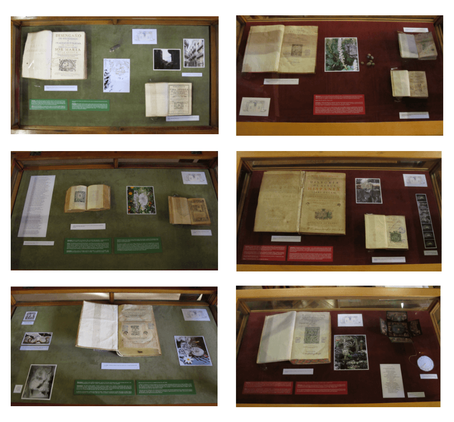
Academic content is typically presented as dense blocks of text, chronological lists, or technical specifications that work well in papers and books but not on screens.
The project required inventing a new information architecture: fragmenting the narrative into accessible layers, creating visual entry points, linking internal references, and designing an experience that invited both scholars and curious visitors to explore the marks.
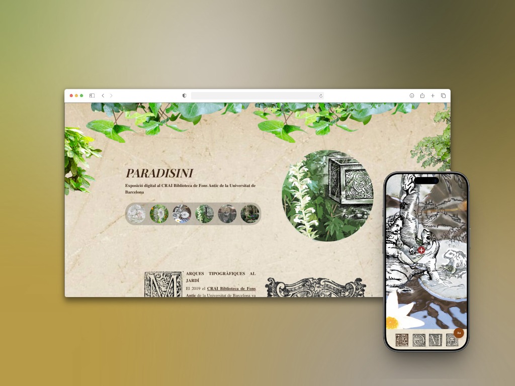
The "digital garden" metaphor was not just visual, but structural: instead of linear navigation, the design allowed multiple exploration paths (by mark, by printer, by historical context, by visual gallery), reflecting how a real visitor traverses a garden: jumping from point to point based on interest.
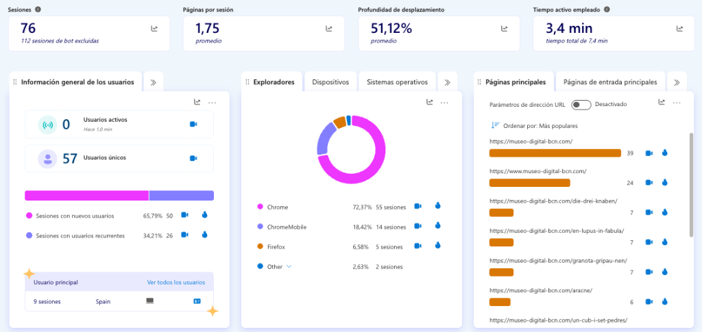
Additionally, user research showed that this profile (academics and students) prefers consuming content on desktop. Therefore, the desktop experience was prioritized (Desktop First), leveraging the large screen to showcase detailed engravings and improve readability, without neglecting the mobile version.
Thus, Paradisini sought to demonstrate that academic content, if structured and presented correctly, can be just as attractive and accessible as any other digital experience, without losing rigor or depth.