IX Comercio

UX & CRO Optimization for a 4-store e-commerce network: from catalog to checkout.

Role UX/UI Designer
Timeline 2.5 Years
Tools Figma, GA4, Hotjar, Clarity
IX Comercio Hero Mockup
01

The Challenge

Scaling while maintaining consistency

IX Comercio manages multiple technology e-commerce stores across different Latin American countries, with catalogs ranging from smartphones and computers to monitors and tech accessories.

The four stores shared the same template base and system, but each needed specific adaptations per country and brand: checkout steps, communication style, tone of voice, and visual customization according to each manufacturer's manual of style.

The challenge was not just "making a usable store", but building a system capable of scaling, maintaining a consistent experience while adjusting flows, messages, and interface elements to the particularities of each market.

02

Context & Role

Continuous improvement cycle

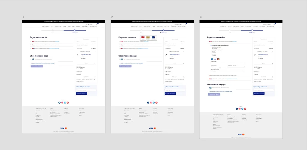
My work began with the implementation and adaptation of the base template for each country and store, adjusting structure, content, and visual layer to align them with the brands and local expectations.

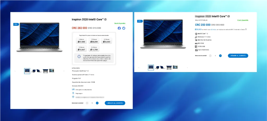
From there, it evolved into a continuous improvement cycle: reviewing user interactions with Hotjar, Clarity, and Google Analytics, gathering feedback through forms and surveys, and translating all of that into concrete changes in the platform.

I participated in the entire improvement design flow: problem identification, flow definition, prototyping, internal testing, team socialization, and final implementation review.

Audit and Flow Analysis
03

The Experience

Focus on Checkout & Financing

One of the key focus areas was the checkout: the flow was simplified to allow users to complete fields in different orders, more relevant payment methods were added for each country, and the order status was clarified at each step, reducing dependency on the support team.

We also designed and implemented a system to clearly show payment installments when financing a product, making the offer more attractive and transparent for users highly sensitive to payment methods—a critical factor in LATAM.

The approach relied on A/B testing with Google Optimize on home page elements and the purchase flow, comparing module variants, messages, and content hierarchy to understand which versions facilitated better navigation and conversion.

Product Page Optimization
04

Results

Cumulative Impact

Although the stores started from the same technical base, continuous work on flows, messages, and bugs reduced visible friction in checkout and mobile navigation, making the purchase process clearer and more predictable.

Support ↓ Fewer basic questions thanks to transparency in installments and order status.
Iteration Consolidation of a data-driven design culture and continuous improvement.

Next Project