Genera Digital

UX/UI Redesign & Brand Identity for an agency seeking leadership and conversion.

Role Lead UX/UI Designer
Timeline 4 Weeks
Tools Figma, Adobe Suite
Genera Digital Showcase

The Challenge

Genera Digital had an identity problem. Their proposition was solid, their team exceptional, but their visual communication did not reflect the transformative power they offered. Marketing managers seeking visual impact didn't see results reflected on their web. They needed an identity that spoke directly to ambitious brands seeking strategic leadership, not just services.

01

Research

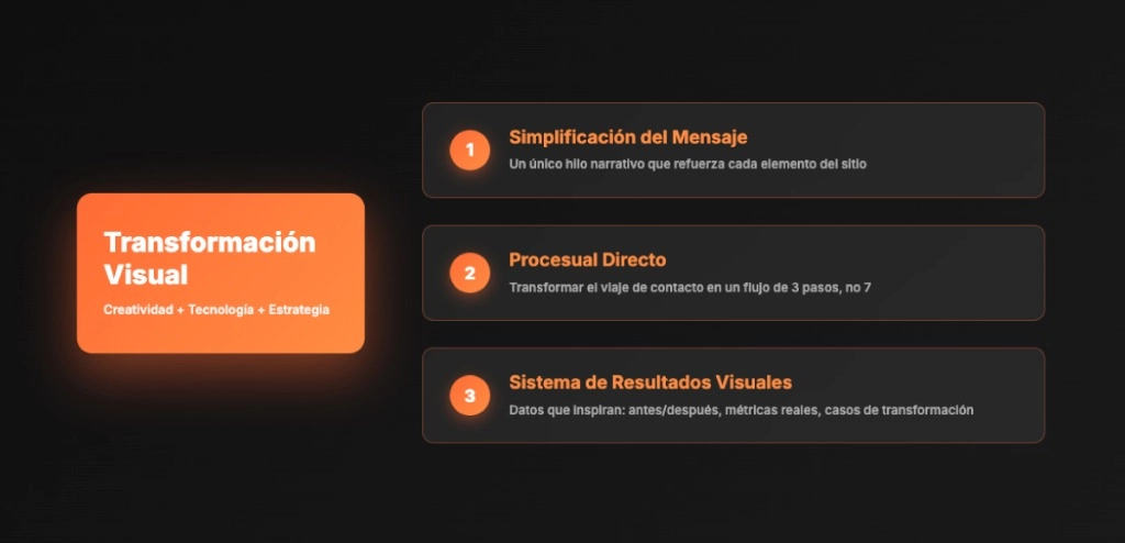
Talking to decision makers

We interviewed 6 marketing directors and founders (33-45 years old) from diverse sectors. Creative, alternative people who value sector knowledge and demand tangible results. Insights were decisive:

  • Results yes, but visually verifiable
    Visual impact must reflect performance.
  • Structure is fine, but we need to see it in motion
    Gradients and transitions communicate transformation.
  • Simplify the journey: direct contact
    Fewer steps, maximum impact.
  • If it doesn't look good, I don't trust it works
    Aesthetics ARE the quality guarantee.
User Survey
02

Strategy

Transformation Strategy

From complexity to coherent system

We defined two strategic pillars:

  1. Message Simplification: We reduced the narrative to a single thread: "Creativity + Technology + Strategy = Visual Transformation".
  2. Direct Process: We transformed the contact journey into a 3-step flow. The user enters, sees Genera's power, gets convinced, and converts.
  3. Visual Results System: Each section must show before/after, real metrics, transformation cases. Not just text: data that inspires.
03

Visual Design

Color as transformation narrative

Orange was not a casual aesthetic choice. In color psychology, it represents energy, transformation, and modernity. We used it strategically in gradients and transitions suggesting movement, growth, and change.

Key system features:

  • Moving gradients: Colors are not static. They flow, transform, suggest everything is constantly evolving.
  • Bold Typography: Campton Bold in headings to communicate strength and security.
  • Strategic negative space: Allows visual elements to breathe and stand out.
  • Transparencies and layers: Reflect the idea of the "living system" where everything is connected.
04

Prototyping

Structure and Validation (Low-Fi)

Before applying style, we validated the structure. We focused on low-fidelity prototypes to ensure each section had a well-thought-out and structured impact.

  • Visual Hierarchy: We prioritized key content without aesthetic distractions.
  • User Flow: We designed the journey so conversion is natural, not forced.

Working in "low quality" visual allowed us to rapidly iterate information architecture until guaranteeing the transformation message arrived clearly.

Low-Fidelity Wireframes
05

Results

The impact of clear identity

Post-launch, numbers speak:

Most importantly: Genera Digital went from being "just another agency" to being "the agency that understands visual transformation because THEIR OWN TRANSFORMATION is visible".

Next Project